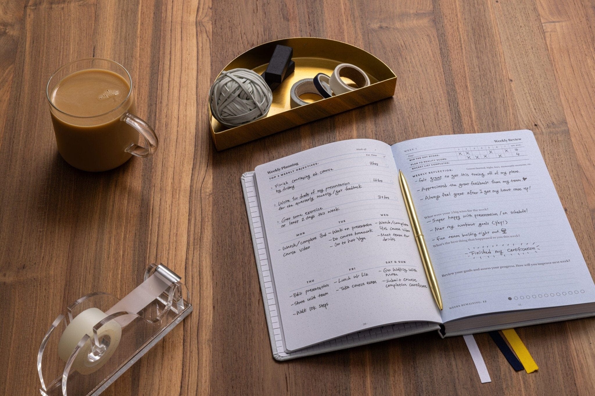
A sneak peek into the journey we travelled when designing the customer experience for the Self Journal. From the packaging design, to the mailing box to everything in between.
When developing BestSelf from a Kickstarter-funded company into a business and e-commerce store, Allen, myself and the BestSelf team were very conscious about crafting every piece of the customer experience. From the design of the store to the product packaging to the mailing box it was delivered in.
How could we make every step of the journey a pleasurable experience?
Don’t underestimate how much these things matter. Think of a company that has an excellent customer experience.
Apple.
Nothing is too small to be beautiful. Every inch of the packaging is thoughtfully crafted enough that many of us even save the box because it seems a shame to throw out.
(Essentially since I’m living in New York City I pay a portion of rent for my Macbook Pro box.)
When designing the Self Journal, our flagship product, we knew we wanted to create a similar experience to Apple from the moment our product arrived at a customers door to actually opening the package.
Some questions we asked:
- How can we build anticipation before the Self Journal box is opened?
- How do we create an experience to remember?
- Can we tell a story through the packaging?
Why Packaging Was So Important:
Over the past several years I’ve dealt with the postal service enough through my another e-commerce venture to know that sending books, or in this case, beautiful journals in a package without external protection would only end in disaster.
Additionally, with the 13 Week dry-erase wall calendar we included with each Self journal it seemed the only answer was a box. While the box was a practical answer for these problems, it could also serve a greater purpose - it was an opportunity to create an experience and tell a story.
The Box Design
Creating Packaging with Purpose
Our mission was to design a beautiful box that people would keep, but we didn’t want it stored in the back of a closet somewhere gathering dust, it should still serve a purpose.The Self Journal chronicles your goals and serves as a physical representation of your achievements. These goals should be celebrated and put on display which is why we designed the box the way we did.
On each side of the box is a visual representation of the book that sits within. It was minimalist yet tells you what you need to know. Some rough original sketches:

We used this water image from Unsplash by Kate Chikina to serve as the base of the book texture on each side of the box. This water theme distills a sense of focused calm.

The Design:

By using a spot-gloss coating on the side of the box it could be used to label the journal box for your own records, which becomes a way to chronicle your goals.

The Final Product:

The Box Outside The Box
The beautiful Self Journal box would need to be sent within another box to avoid damage. We had a two options;
- a standard box (boring)
- designing custom boxes with our branding on the outside (fun!)
We liked the idea of designing a custom box, however, due to the economies of scale, this didn’t seem very sensible. With a few different product offerings, we’d be paying for high costs low minimums for different sizes of boxes.

What if someone purchased a bulk order that needed a larger box? Essentially this is a valued customer, yet we would need to use a regular box, and so they would not get the same experience as someone who bought less.
Every customer should receive the same care, consideration, and buying experience - without breaking the bank. Then I got an Amazon package through the mail and had my a-ha moment.

Custom kraft packing tape that could be taped on any shape of any box, mailing tube etc.
We got to work, sourced a supplier close to our fulfillment center in Minnesota and got a template. The template was 14“ x 3” wide so the key was creating a design that looked good in a repeating pattern.
While our logo made sense for branding purposes, I wanted to make it more than just a promotional design. Much like our other design elements, it could and should serve a dual and greater purpose. Could we somehow positively affect someone who’s not even the intended recipient?
That’s where the idea for quotes on the packing tape came from:

The End result:
Hand-Lettered by a founder
Getting postcards or promotional material inside a product case isn’t anything new, we knew this. However, we wanted to create something with high touch that showed how grateful and thankful we were to our supporters and customers. A design element that couldn't be re-created easily by just anyone.
I had been playing around with some hand letting for a while and decided to see what I could come up with for Best Self so in the weeks after the Kickstarter ended I started sketching and brainstorming ideas.
The Pencil Sketch & Inked Letters;

After digitizing the original sketch and cleaning it up, this was the final result:

Composition:
The last piece was working on a composition and how everything fit together. While designing the interior insert to go within the box I created some small sketches to show the manufacturer how each journal should be placed within the box with the calendar and the insert.


The yellow bookmark serving with a secondary function so as to easily lift the book from the box.
The Final Product:

